Historic Waits Advisor
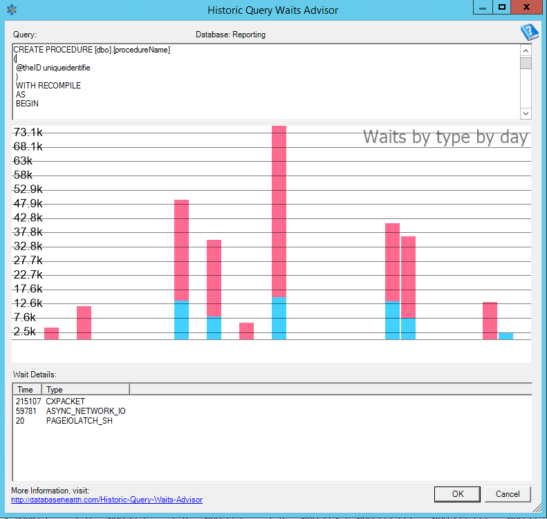
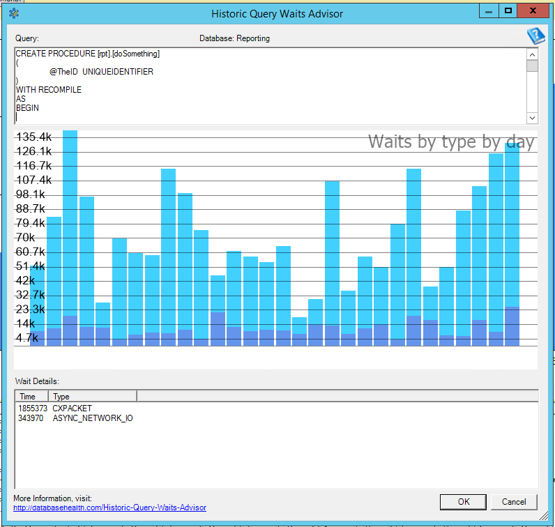
The Historic Waits advisor gives you a break down of the waits that have been caused by a given query or plan. For instance in screenshot below you can see that IO_COMPLETION is the most common wait type from the report, followed by WAITFOR, then RESOURCE_SEMAPHORE. You can see how these are tranding over time.
“This is absolutely the coolest feature in the Database Health Project.” – Steve Stedman
Download Database Health Reports now for free.
Enroll Today!


Steve and the team at Stedman Solutions are here for all your SQL Server needs.
Contact us today for your free 30 minute consultation..
We are ready to help!
 Download this page in PDF format
I just downloaded the most current version and on Historic waits on my database I cannot see the dates nor the legend of colors. I cannot scroll the graph area at all.
I have the same problem reported by Diana above. The graphic I see is very different. Not only the legends and dates reported by Diana, but also has the sentence “waits by type by day” at the top of the graphic’s grid, and the “billion” after the numbers in my case (“21,9 Billion”, for instance).
Congratulations on the software, anyway. So far, it proved to be very useful.
Roberto and Diana – Yes, I am also seeing the same thing. I am looking into this now.
-Steve Stedman
I have found the bug and fixed it. The in the next release of Database Health Monitor you should be seeing the updated chart fix. Also, I updated the screen shots on this post as they were a bit old.
-Steve Stedman