Is This Query Slower Than Normal? Ask Its Own History
The app feels slow. You open Query Store and find a query that averaged 300 ms yesterday and 500 ms this morning. Is this query slower than normal, or is that just a Tuesday? You cannot tell, because nobody ever wrote down what normal looks like for that one query.
Is this query slower than normal in SQL Server, or is that just its usual range? To tell whether a query is slower than normal in SQL Server, compare its recent Query Store readings with limits built from its own earlier history: the average, plus and minus three sigma. A reading past those limits, or eight in a row on one side of the average, means the query has genuinely changed.
Database Health Monitor does that arithmetic for you in the Performance Baselines report. It takes each of your busiest queries, learns its normal range from its own earlier readings, and tests the recent readings against that range. Here is the whole page, on a database with a month of Query Store history.
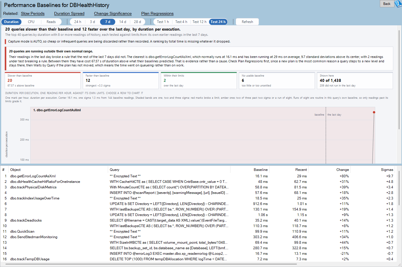
Performance Baselines is one of the reports in Database Health Monitor. It runs against your own servers, and it takes about a minute to have this same screen open on one of them.
In this post
- Is this query slower than normal? Not by a fixed threshold
- Measuring a query against itself
- Three rules, four grades
- What the screen puts in front of you
- Getting a baseline to exist
- What to do with a flagged query
Is this query slower than normal? Not by a fixed threshold
Most of us reach for the same three reflexes. A duration alert. A list sorted by average duration. A comparison of this week with last week. All three judge a query by its size, and none of them asks how far that particular query usually moves.
Take the jump from 300 ms to 500 ms. If the query has spent the week wandering between 200 and 600 ms, that jump is a shrug. If it has never once left the band from 295 to 305, it is an incident. Same numbers, opposite meaning. Only the query's own history can tell them apart.
There is a second failure that a threshold cannot see at all. A query can settle at a new, higher level without ever crossing a line. No spike, no alert, just a query that quietly lives somewhere else now. Eight readings in a row on one side of its usual level is how you catch that.
So the number worth having is not milliseconds. It is distance from the query's own center, counted in standard deviations. That compares across queries. Four sigma on a quick lookup carries the same weight as four sigma on a slow report, whatever the clock says about either.
Measuring a query against itself
For each query, the report takes one reading per period. Normally that is one per Query Store interval. A reading is the average cost of a single execution in that period. The earlier part of the window is the baseline, and the recent part is the period under test. The limits are built like this:
- The center is the mean of the baseline readings. Every period counts equally. An hour with nine executions is as much evidence about how the database behaved at four in the morning as an hour with nine thousand.
- One sigma is not a plain standard deviation. It is the average gap between consecutive baseline readings, divided by 1.128. A plain standard deviation would treat a mid-week shift as noise, and the limits would grow wide enough to hide the very shift that widened them.
- The limits sit three sigma either side of the center. A lower limit that would fall below zero is not drawn.
One rule keeps it honest. The limits come from the baseline only, so the period under test can never move the limits it is judged against.
You choose what a reading measures: Duration, CPU or Reads, always per execution. Execution counts are deliberately not offered. They describe your callers, and a baseline built on them would grade the application's traffic as a fault.
Three rules, four grades
The period under test is checked against three rules. Any reading that breaks one is a signal.
| Rule | What it catches |
|---|---|
| Past three sigma | One reading that does not belong. The strongest evidence. |
| Two of three past two sigma, same side | A spike with a shoulder rather than a single odd reading. |
| Eight in a row on one side of the center | A query that has settled somewhere new, with no spike to alert on. |
Each query then gets one of four grades.
| Grade | When it applies |
|---|---|
| Slower than its baseline | A reading under test broke a rule, and most signals are above the center. |
| Faster than its baseline | The signals are mostly below the center. |
| Within its limits | No reading under test broke a rule. |
| No usable baseline | Fewer than eight baseline readings, every baseline reading identical, or more than a fifth of the baseline broke its own limits. |
Two details matter on real hourly data. First, the direction comes from the signals, not from the average. A query that spiked past its upper limit once on an otherwise quiet day is graded slower, even if its mean for the day went down. Both numbers are on screen, so you can see why.
Second, routine runs are forgiven. Most queries follow the working day, so eight readings in a row on one side of the center happen inside their own baseline every day. When runs fill more than a fifth of a baseline, only the two limit rules grade that query's period under test. The query is not thrown out.
What the screen puts in front of you
A verdict sits at the top. It names the clearest query outside its range, or says plainly that nothing is. Below it, five tiles count the grades: slower, faster, within limits, no usable baseline, and how many queries are shown out of all that ran. Each grade tile filters the grid when you click it.
The faster tile is never green, and that is on purpose. A query that got faster is usually tuning that worked. Occasionally it is a query that stopped doing part of its work. Either way it deserves a look.
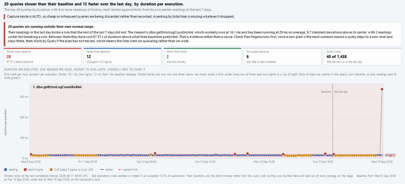
The chart shows one query at a time, the top row of the grid or whichever row you select. Two sets of limits on one chart could not both be read, so it does not try. Each mark is one reading, in order. The bottom axis is the sequence, not the clock, because the rules count consecutive readings. A few times along it anchor the sequence to real life.
Hover over the chart and you get the nearest reading: its time, its value, its distance from the center in sigma, its executions, which side of the divider it sits on, and the rule it broke.

The grid carries the numbers. Baseline is the query's normal cost per execution and Recent is the mean of its readings under test. Change is the gap as a percentage, and Sigmas is the same gap in standard deviations. Cost of it is the time the test period spent above or below what the baseline predicted. Signals counts the readings that broke a rule, and Readings counts baseline plus test.
Read Change and Sigmas together. A large percentage with a small sigma count is a query that always wanders. A modest percentage with a big sigma count is a query that never does. That contrast is the whole point of the page.
Getting a baseline to exist
You need SQL Server 2016 or newer, Query Store switched on for the database, and VIEW DATABASE STATE so the report can read the catalog views. The data comes from sys.query_store_runtime_stats, joined to the interval, plan, query and query text views. Find the page in the tree under a database, at Real Time, Query Store, Performance Baselines. It is hidden on master and tempdb, where Query Store cannot be turned on.
The toolbar sets the window (24 h, 3 d, 7 d, 14 d or 28 d) and the period under test (1 h, 4 h, 12 h or 24 h) at the end of it. If the test period would eat too much of the baseline, the report cuts it to half the window and says so in the footer. A query needs at least eight baseline readings and at least one reading under test. The 40 queries with the highest total cost are graded.
A reading is one Query Store interval unless that interval is short against the window. A query gets at most 400 readings. A one minute interval over a week therefore becomes 30 minute readings, and the default 60 minute interval over four weeks becomes two hour readings.
Three details keep the readings honest. The window ends at the last completed interval, so a half collected one never skews the end. Readings sit on a fixed grid counted from midnight, so the split between baseline and test never lands one reading late. And only regular executions count. A query canceled by a client timeout records the timeout as its duration, and a burst of those would be the application giving up, not the query slowing down. Aborted and failed executions are tallied in the footer instead.
What to do with a flagged query
Being outside the limits is evidence, not a diagnosis. You now know that this query changed and when. You do not yet know why. Right-click the row and the report offers the next two questions.
- Go to Plan Regressions shows whether the plan changed. If it did, that page carries a script to force the old one.
- Go to Waits by Query shows what the query queued on. That is the place to go when the plan stayed put and the time went elsewhere.
- Explain this baseline lists the center, sigma, limits and recent mean, with every reading that broke a rule and its time. It is the version you can paste into a ticket.
If the drifting statement is a write, the cost may sit in the table rather than the statement. Our post Find SQL Server Unused Indexes Before They Cost You covers why extra indexes make every write dearer.
Some databases will show many queries with no usable baseline. On a busy system whose load swings hard through the day, a query's own readings can break its limits more than a fifth of the time. Limits built on that would describe a process that was never steady, so the page declines to grade it. Try a longer interval between readings, or look at the Hourly Drift page instead.
Two messages are worth recognizing. One says no query has enough history to have a baseline. Widen the window or shorten the test period. The other says the test period was fitted, which only means the report trimmed it to leave enough baseline.
The full column and control reference lives on the Performance Baselines documentation page. Run it against a database where something feels slow and you will know within a minute whether the feeling has evidence behind it.
What to check on your own server
- Check that Query Store is on for the database you care about and that your login holds VIEW DATABASE STATE
- Pick one query you suspect and compare its recent average cost per execution with its own week of history, not a fixed threshold
- Look for eight consecutive readings on the same side of that query's average, a shift no threshold alert will catch
- Check whether the flagged query changed plan before you look at what it waited on
Try Database Health Monitor Today
Performance Baselines tells you whether a query is outside its own normal range, so a jump from 300 ms to 500 ms stops being a guess. Database Health Monitor shows it on every instance you connect, in the time it takes to open the report.
Download Database Health Monitor and run the Performance Baselines report against your own server. There is nothing to configure first, and you will know inside a few minutes whether it tells you something you did not already know.
Related reading: Is a SQL Server Query Regression Statistically Significant?. A companion piece runs the same kind of question through Change Significance's precision funnel, turning a query's own run-to-run noise into a hard threshold so a scary percentage and a real regression stop looking like the same thing.
Related reading: Is Your SQL Server Response Time Target Being Met?. A companion report checks Query Store's own execution history against a response time target you choose, like 95% of executions within 500 milliseconds, and ranks the queries missing it most often rather than the ones simply running longest.