Waits
Overview
The Waits report shows where this instance’s time goes when it is not running: a budget across the wait categories at the top, and then one bar per wait type underneath, grouped by category.
The question people open this page to answer – what kind of thing is this instance waiting on – is a two-level hierarchy, and a flat list of leaf nodes cannot express it. PAGEIOLATCH_SH, PAGEIOLATCH_EX and IO_COMPLETION are three rows in a list and one answer: storage.
Every bar is split two ways:
- The solid part is time spent waiting on the resource itself.
- The hatched part is signal wait – time the thread spent runnable, queueing for a CPU after the resource was already free.
That distinction is the most useful thing on the page and it is why signal time is hatched rather than given a colour of its own. A wait that is 3% signal is the resource being slow. A wait that is 96% signal is the resource answering promptly and the thread then queueing for a scheduler. Those are completely different problems that a single “wait time” number cannot tell apart.
Bars share one absolute scale across everything on screen. Normalising per row is what a proportional split bar does, and it would destroy the row-to-row comparison the chart exists for.
Where to find it
| Route | How |
|---|---|
| Server tree | Right-click the server → Instance Level Reports → Waits |
| Server Overview page | Click the Waits half-panel chart in the CPU by Database and Waits panel |
| Connections report | Related Links bar → Waits |
| Report arrows | Previous is Migration Planner, next is What is Active |
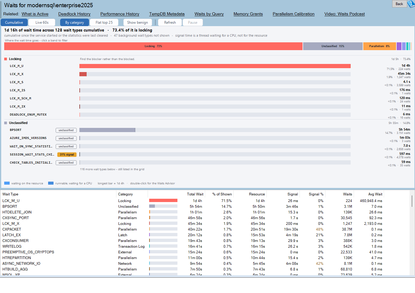
The page title reads Waits for <server name>, and the help button opens https://databasehealth.com/Waits.
The chart is also captured into the SQL Server Health Report advisor output, where it is the last section.
Note that Waits by Type is a different, database-level report. This one is instance-wide.
Requirements
VIEW SERVER STATEon the instance, forsys.dm_os_wait_stats.- The query timeout is 45 seconds.
sys.dm_os_wait_statsis normally instant. - The per-instance ignore list feature additionally needs the DBHealthHistory repository to be configured. Without it, the report works normally and only the Ignore menu item is unavailable.
Nothing is installed on the monitored instance, and the report writes nothing except ignore-list entries you explicitly add.
What is excluded, and why
The DMV returns a few hundred rows, most of which are background threads sleeping. The report filters in code rather than in SQL, in two stages.
Background and idle waits
About seventy wait types – and two whole families, everything starting SLEEP_ and everything starting PARALLEL_REDO_ – are treated as background activity and hidden by default. These are the threads SQL Server keeps parked: LAZYWRITER_SLEEP, CHECKPOINT_QUEUE, XE_TIMER_EVENT, REQUEST_FOR_DEADLOCK_SEARCH, the BROKER_* idle waits, the HADR_* housekeeping waits, and so on.
The Show benign button puts them all back. That is a redraw, not a round trip – the data was never thrown away.
Note that this exclusion list is deliberately not the same thing as the Benign category. A wait can be categorised as benign and still be worth showing.
There is no percentage cutoff. Older wait reports stopped at 95% of the running total, which combined with a stale exclusion list could drop every real wait on a modern instance.
Your own ignore list
You can add a wait type to a per-instance ignore list from the right-click menu. That list is stored in the DBHealthHistory repository against the instance, and it is shared with the historic waits reporting.
Both exclusions are declared in the subtitle line, for example:
12 background and 2 on your ignore list wait types not shown
Removing something from the ignore list is done from the Historic Waits report’s Ignore Waits dialog, not from this page.
The categories
Every wait type is assigned to one of eighteen categories:
| Category | Category |
|---|---|
| Locking | Network |
| IO | External |
| Transaction Log | AlwaysOn / Mirroring |
| Latch | Service Broker |
| Parallelism | Backup |
| Memory | In-Memory OLTP |
| CPU / Scheduler | Tracing |
| Full Text | Replication |
| Benign | Unclassified |
Unclassified is a real answer rather than a failure. “We do not recognise this wait” is worth showing rather than hiding in a catch-all bucket, and rows in it carry an unclassified marker.
Each category has a colour, and each wait type within a category gets a shade of it
- darkest for the biggest member – so a family reads as a family.
The guidance text
Each category heading on the chart carries the first sentence of that category’s guidance. Hovering the category’s band in the budget strip gives you the full paragraph. For example, hovering IO:
Check read and write latency for the affected database files before assuming the storage is at fault – large scans caused by a missing or unused index generate real IO that no amount of faster disk will fix. If latency really is high, look at the whole path: the file, the volume, and anything sharing it.
Or Network:
This is usually the client, not the network. An application that reads results row by row, or asks for far more rows than it displays, will produce this wait on a perfectly healthy network. Check how much data the query returns before investigating hardware.
Or Parallelism:
Parallelism waits are normal on a server that runs parallel queries and are not a problem on their own. Treat them as a symptom: find the queries going parallel and ask whether they should be. Review the cost threshold for parallelism and max degree of parallelism together, not in isolation.
Reading the chart
The budget strip
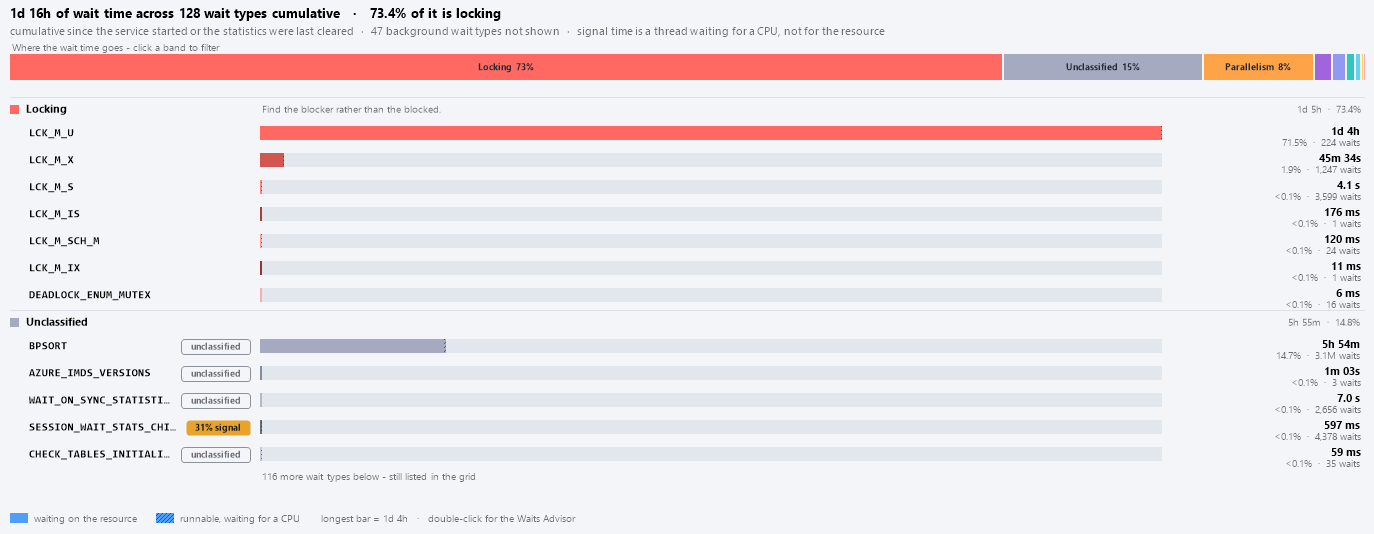
A single full-width stacked bar, captioned Where the wait time goes – click a band to filter. One band per category, largest first, width proportional to that category’s share of all visible wait time. Bands wide enough carry an inline label such as IO 43%.
Clicking a band filters the whole page – chart and grid – to that category. Clicking it again clears the filter. If you were in Flat view, clicking a band switches you back to By category, because a category filter in a flat list is a list.
The rows
Under the strip, one heading row per category – swatch, name, guidance sentence and category total – and under each, one row per wait type showing:
- The wait type name, in a monospaced font.
- A chip, where one applies.
- The split bar: solid resource time, then hatched signal time.
- The total, and a detail line.
Chips
| Chip | When | Colour |
|---|---|---|
62% signal |
Signal share is 50% or more | Red |
31% signal |
Signal share is 25% or more | Amber |
unclassified |
The wait type is not recognised | Outline only |
background |
Shown only because Show benign is on | Outline only |
The first matching rule wins, and healthy rows get no chip at all. The outlined chips are context, not a verdict.
The legend
Two swatches – waiting on the resource (solid) and runnable, waiting for a CPU (hatched) – then the scale note longest bar = 3h 35m, and the hint double-click for the Waits Advisor.
The header lines
The summary line:
3d 4h of wait time across 61 wait types cumulative · 43.2% of it is io · 28.4% of all of it is signal wait
The third clause appears only when signal wait is 15% or more of everything on the page. When it does appear, read it before anything else: it means a meaningful part of what looks like resource waiting is actually queueing for CPU.
The subtitle line states the mode, the exclusions and the definition:
cumulative since the service started or the statistics were last cleared · 12 background wait types not shown · signal time is a thread waiting for a CPU, not for the resource
The amber notice band appears in three situations:
- The wait statistics were reset – a service restart, or DBCC SQLPERF(N’sys.dm_os_wait_stats’, CLEAR). The baseline has re-armed; the next reading will be a real interval.
- Live sampling is arming – the first reading lands in a few seconds. Until then this page is still showing the cumulative totals.
- SQL Server started 6h 12m ago – these totals only cover since then.
Chart interactions
| Gesture | Result |
|---|---|
| Hover a bar | Full tooltip |
| Hover a budget band | Category name, share, the full guidance paragraph, and a click hint |
| Left-click a bar | Selects that wait type’s row in the grid |
| Left-click a budget band | Filters to that category; click again to clear |
| Double-click a bar | Opens the Waits Advisor for that wait type |
| Right-click a bar | The wait-type menu, plus Copy Chart to Clipboard |
| Right-click empty space, header or legend | Copy Chart to Clipboard only |
The bar tooltip:
PAGEIOLATCH_SH (IO)
3h 35m - 43.2% of everything on this page
4.2M waits · avg 3.1 ms · longest 2.4 s

Resource 3h 21m · Signal 14m (6%)

Storage wait - look at disk latency if this is sustained.

Click to find this wait type in the grid - double-click for the Waits Advisor.
When signal share is 25% or more, an extra line is added:
A high signal share is the thread queueing for a CPU after the resource was already free – that is CPU pressure, not a slow resource.
If the chart runs out of room, the rows stop and a muted line reads 14 more wait types below - still listed in the grid. Nothing is dropped; the grid always has everything.
Reading the grid
| Column | Units | What it is |
|---|---|---|
| Wait Type | – | The wait_type from the DMV. |
| Category | – | One of the eighteen categories. |
| Total Wait | time | Total wait time. Drawn with a split in-cell bar matching the chart. |
| % of Shown | percent | Share of all visible wait time. Under 0.1% shows as <0.1%. |
| Resource | time | Total wait minus signal wait – time genuinely waiting on the resource. |
| Signal | time | Time runnable, queueing for a CPU. |
| Signal % | percent | Signal as a share of this wait type’s total. Coloured. |
| Waits | count | Number of waiting tasks. |
| Avg Wait | milliseconds | Total wait divided by the wait count. |

Signal % is the only coloured column: red at 50% or more, amber at 25% or more, normal below that.
There is no status column and no OK/Warning/Critical verdict. Nothing on this page marks a category as a problem, and there are no per-category severity thresholds. The biggest category is simply the widest band. Wait statistics describe; they do not diagnose on their own.
One thing to know about the percentages
Every share on the page is measured against all visible wait types, not against the rows currently drawn. In Flat top 25 the percentages will therefore not add up to 100, and the summary line counts the 25 drawn while the total covers everything visible.
Sorting, filtering and copying
- Click a column header to sort; click again to reverse. Sorting uses raw values, so
3h 35msorts above842 msrather than being read as the number 3. - Right-click for Copy, Copy with Headers (pastes into Excel), Select All, Filter ‘<column>’ and Reset Filters, plus the wait-type items.
- Double-click a row to open the Waits Advisor.
Selecting a row highlights the matching bar, and vice versa. The selection is tracked by wait type name so it survives a Live refresh.
The toolbar
| Button | What it does |
|---|---|
| Cumulative | Totals since the service started or the statistics were last cleared. The default. |
| Live 60s | The difference between two readings, sampled every 60 seconds. |
| By category | Grouped under category headings. The default. |
| Flat top 25 | The 25 largest wait types, ungrouped. |
| Show benign | Toggles the background and idle wait types into the list. |
| Refresh | Re-read now. |
In Live mode a countdown reads next reading in 47s. In Cumulative mode the label is blank.
Cumulative and Live
Cumulative is what the DMV natively holds: totals since the SQL Server service started, or since somebody cleared the statistics. It is available instantly and it describes everything that has ever happened – including the reindex two weeks ago.
Live 60s takes the reading already on screen as a baseline and then shows only the difference between successive readings.
- The first Live sample is pulled forward to 10 seconds, because a minute of an empty page is a long time to wait to find out whether the mode works. Until it lands, the cumulative numbers stay on screen and the amber notice band says so.
- Each sample re-reads the DMV, subtracts the previous reading and redraws in place.
- If a counter goes backwards, the statistics were cleared or the service restarted. The baseline re-arms and the notice band tells you.
- Sampling pauses while a right-click menu is open, and stops when you navigate away.
Live is the right mode for a problem happening now. Cumulative is the right mode for understanding the shape of a workload.
Flat top 25
Drops the category headings and lists the 25 largest wait types on their own. Each row keeps a small category colour tick to the left of its name, because without the heading the row has lost the only thing that said which family it belonged to.
There is no “clear wait statistics” action on this page. The report never issues DBCC SQLPERF. The command is named in the notice band and in the copied script as an explanation of where a reset could have come from, not as something the report will do for you.
Right-click actions
| Item | What it does |
|---|---|
| Waits Advisor for <WAITTYPE> | Opens the advisor dialog. |
| Copy Wait Type to Clipboard | Just the name. |
| Copy Wait Statistics Query to Clipboard | A script that reports this wait type’s counters, plus a second query showing who is waiting on it right now. |
| Ignore <WAITTYPE> on this instance | Adds it to this instance’s ignore list. Only shown when it is not already ignored. |
| Copy Chart to Clipboard | (chart only) The whole chart as an image. |
The copied query is investigation only. Nothing on this page runs anything against the instance except the ignore-list insert.
If the historic database is not configured, choosing Ignore tells you so rather than failing silently:
The ignore list is kept in the historic database, which is not configured for this instance yet.
PAGEIOLATCH_SH has not been ignored.
The Waits Advisor
Double-clicking any bar or grid row opens the Waits Advisor, an in-app dialog backed by a curated set of wait-type descriptions. It shows the wait type, its share of the page, its category, a severity line, a description, which SQL Server versions it applies to, and suggestions.
Where the advisor has no entry for a specific wait type, it falls back to family-level advice and labels it as such: General guidance for IO waits:. It also links to the matching page on databasehealth.com.
How to read the report
- Check the mode. Cumulative or Live? If cumulative, how long has the instance been up? The notice band warns you below 24 hours.
- Read the budget strip. One glance tells you what kind of thing this instance waits on.
- Check the summary line for the signal clause. If 15% or more of everything is signal wait, you have CPU pressure regardless of what the categories say.
- Scan for red and amber chips. A high signal share on a specific wait type means the resource answered and the thread then queued for a scheduler.
- Hover the biggest band for the category guidance. It usually names the next thing to check.
- Switch to Live and watch for a few intervals. If the shape changes completely, you were reading history.
- Double-click the biggest bar for the Waits Advisor.
- Hide the noise. If something you know to be irrelevant on this instance keeps dominating, right-click and add it to the ignore list.
Common patterns
IO dominates, low signal share. Storage, or a query doing far more IO than it needs to. Go to I/O by Database and I/O by Drive. The category guidance says it well: a missing index generates real IO that no amount of faster disk will fix.
Any category with a high signal share across the board. CPU pressure. The resources are answering; threads are queueing for a scheduler afterwards. Look at CPU before you look at the resource.
Locking dominates. Find the blocker rather than the blocked. Use What is Active and Blocking by Hour by Day.
Parallelism (CX*) at the top. Normal on a server that runs parallel queries, and not a problem on its own. Treat it as a symptom and find which queries are going parallel.
ASYNC_NETWORK_IO near the top. Almost always the client, not the network – an application reading results row by row, or asking for far more rows than it displays.
A large Unclassified bar. A wait type this version of Database Health Monitor does not recognise. Worth looking up; it is shown rather than hidden precisely so you can.
Everything is tiny and nothing stands out. That is a healthy answer. If the instance is nonetheless slow, the problem is likely CPU or a client, not waiting.
Where the data comes from
One query per reading, against sys.dm_os_wait_stats, with waiting_tasks_count > 0. The report also reads the creation date of tempdb as a proxy for when the service started.
Nothing is stored. These counters are cumulative since the service started or since DBCC SQLPERF(N'sys.dm_os_wait_stats', CLEAR) was last run, and Live mode computes differences on the client. For wait history over days or weeks, use the historic waits reporting.
Settings
| Setting | Default | Values |
|---|---|---|
InstanceWaitsMode |
0 |
0 = Cumulative, 1 = Live 60s |
InstanceWaitsGrouping |
0 |
0 = By category, 1 = Flat top 25 |
InstanceWaitsShowBackground |
0 |
0 = off, 1 = Show benign on |
All three are per-user, not per-instance – switching servers keeps the same mode. The category filter, the selected wait type and the grid sort are not remembered.
The per-instance ignore list is not in this file; it lives in the DBHealthHistory repository.
Dark mode and colour-blind mode change every colour but nothing else. In colour-blind mode the category palette switches to a muted, colour-blind-safe set.
Messages you may see
Nothing worth reporting – only in Cumulative mode with no visible rows:
Nothing on this instance has waited on anything worth reporting. Every wait type recorded so far is background activity. That is the best possible answer this page can give.
The toolbar is still there, so you can turn on Show benign and see what was hidden.
The query timed out:
The wait statistics lookup did not finish in time. sys.dm_os_wait_stats is normally instant; try the Refresh button.
In the chart: Nothing to show.
Related reports
| Report | Why you would go there |
|---|---|
| What is Active | What is running right now, and what it is waiting on. |
| Deadlock History | Where Locking waits turn into deadlocks. |
| Performance History | The same instance over time. |
| I/O by Database and I/O by Drive | Where IO waits actually land. |
| Blocking by Hour by Day | When Locking waits happen. |
Frequently asked questions
What is signal wait, really? The time between the resource becoming available and the thread actually getting a CPU to continue on. A high signal share means the resource was not the bottleneck – the scheduler was.
Why does the report hide so many wait types? Because most of what sys.dm_os_wait_stats returns is background threads sleeping. Click Show benign to see them; they are marked with a background chip.
Why do the percentages not add up to 100 in Flat top 25? Because they are measured against all visible wait types, not against the 25 drawn.
Can I clear the wait statistics from here? No. The report never issues DBCC SQLPERF. It names the command so you know what could have reset your counters, not so it can run it.
How do I remove something from the ignore list? From the Ignore Waits dialog on the Historic Waits report. This page can only add.
Are the totals since the server started? Since the service started or since somebody cleared the statistics. There is no way to tell those apart from the DMV, which is why the subtitle says both.
Why is a wait type Unclassified? It is not in the taxonomy – usually a newer SQL Server version’s wait type. It is shown rather than bucketed, so you can look it up.
Does anything on this page tell me a category is a problem? No, deliberately. Wait statistics describe where time goes. The only red and amber on the page are signal-wait shares, which are a genuine, well-defined signal.