SQL Server CPU History: Read a Week in One Glance
The server crawls every few Tuesdays and nobody can say why. You pull up the month of CPU as a line chart and get a wall of spikes. Zoom into one afternoon and it tells you nothing about the other twenty. The real question is not what happened at 1 PM. It is whether 1 PM always looks like that, and your SQL Server CPU history can answer it.
How do I see SQL Server CPU history by hour and day? The fastest way to read SQL Server CPU history is a heat map with hours down the side and days across the top. Each cell is one hour, and darker means busier. Nightly maintenance, the business day and a single bad Tuesday show up as bands and columns you can click.
Database Health Monitor records CPU samples into its history repository, and the CPU by Hour by Day report lays them out as one grid. It is a historic, instance-level page, so it reads stored samples rather than the live server. That also means it still opens when the monitored instance is down.
Why the line chart lets you down
CPU has a weekly rhythm. Backups run at night, users arrive at nine, and month end is rarely a surprise. A line chart spreads that rhythm along one long axis, so Monday morning and the following Monday sit weeks apart on screen and you cannot compare them by eye.
Averages are no better. A daily average of 35 percent can hide a four hour stretch at 90 and a long, quiet tail. You want the same clock hour from different days stacked next to each other. That is a grid, not a line.
What SQL Server CPU history looks like as a heat map
Hours run down the side, days run across the top, and every cell is one hour of one day. Darker means busier. The columns line up by day of week, which is why every Monday sits in the same position and a repeating problem becomes a visible stripe.
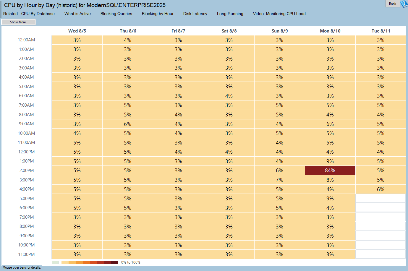
CPU by Hour by Day (historic) is one of the reports in Database Health Monitor. It runs against your own servers, and it takes about a minute to have this same screen open on one of them.
Three shapes do most of the work:
- A dark horizontal band at one hour. Maintenance such as backups, index rebuilds or CHECKDB. Expected, but confirm it ends before people log in.
- A dark block across business hours. Normal for a transactional system. Ask whether it is getting darker month over month.
- One dark vertical column. A single bad day. This is the one to click.
A fourth shape deserves a second look. If dark cells creep earlier and later on either side of the working day, load is growing at the edges, and that is often the first visible sign of a capacity problem. A checkerboard with no structure means either truly variable load or a range too short to show anything. Go to six weeks before you decide.
Empty is not idle
Some cells are drawn differently from the coolest color. That is deliberate. An hour where nothing was recorded is a different fact from an hour that recorded zero percent: one means the collector was not running, the other means the server was quiet. If every day is blank at the same hour, the collection service was stopped then. Do not read it as a restful server.
The same care went into the colors. The ramp gets steadily darker from end to end, so you can read magnitude from lightness alone. It holds up in grayscale and on a projector, and a single blue hue handles color vision deficiency. Dark mode inverts the ramp so hot cells still stand out from the background.
Click the cell, then split the CPU
A click on any cell opens CPU Load for Hour, with every sample the collector took in that hour. The chart stacks two bands. The bottom one is SQL Server. Above it sits everything else running on the machine, and whatever remains is headroom.
This split settles an argument before it starts. SQL Server at 40 percent on a box that reads 95 is a different finding from SQL Server at 95, and the first one is not a SQL Server problem at all. Both figures were always collected. Only the sum, 100 - IdleCpu, used to be drawn.
Two more views help. Compare puts the same clock hour from earlier days behind today's line, so a 90 percent spike at 1 PM is clearly an incident or clearly a batch window. Queries ranks what the active query collector caught during the hour, worst CPU first, one row per query. Right click a row for its text or its stored plan. That plan was saved while the query ran, so it survives an hour that ended weeks ago and a plan cache that has long since moved on.
Gaps are drawn as hatching. A straight line across a stretch with no samples would be an invention, so the report does not draw one. The Queries view needs the active query collector installed, and on a central repository it tells you the captures belong to the repository's own server rather than showing the wrong queries.
Range, requirements and where to go next
The toolbar has Show More and Show Less. They add or remove a week, from one week up to six. One catch: the range is shared by every by-hour-by-day report, so setting CPU to four weeks moves Blocking, Long Running, TempDB, Deadlocks, Disk Latency and I/O to four weeks as well. That keeps any two pages comparable, but changing it here changes it everywhere.
The data comes from the CPU table in the DBHealthHistory repository, filled by the collection service. No collection configured, nothing to draw. Full details are in the CPU by Hour by Day (historic) reference.
Once you know which hours are hot, move sideways. CPU by Database shows who spends it, CPU by Query shows which statements, and SQL CPU Schedulers tells you whether the busy hours truly saturate the processors. Blocking by Hour by Day and Long Running by Hour by Day show whether contention and slowness peak when CPU does. For the wider view of how these pages fit together, read SQL Server Historic Reporting: One Page, One Click.
What to check on your own server
- Open the CPU heat map at the default range and note which hours are dark on a normal day
- Look for horizontal bands first and confirm the nightly one still finishes before the working day starts
- Compare the same hour across several days before you decide a dark cell is unusual
- Click the darkest cell that surprises you and check whether SQL Server or something else owns the CPU
- Widen the range to six weeks when a pattern could be coincidence
Try Database Health Monitor Today
CPU by Hour by Day turns weeks of recorded CPU samples into one heat map, so a recurring pattern or a single bad day stands out without reading a number. Database Health Monitor shows it on every instance you connect, in the time it takes to open the report.
Download Database Health Monitor and run the CPU by Hour by Day (historic) report against your own server. There is nothing to configure first, and you will know inside a few minutes whether it tells you something you did not already know.