SQL Server Historic Reporting: One Page, One Click
A job that took eleven minutes on Monday takes nineteen by Friday, and nobody touched the query. A report that used to run before your coffee got cold is now the one everyone schedules around. The data drive fills faster than the growth plan you wrote six months ago, and by the time it is urgent, nobody remembers what normal looked like. None of that shows up as an error message. It shows up as a feeling that something got worse, with no timestamp attached, which is exactly the gap SQL Server historic reporting is supposed to close.
The obvious move is to open a DMV while the job is actually slow: run +’sys.dm_exec_requests’+ during the bad run, or catch +’sp_whoisactive’+ at the right second. That works if you happen to be watching at the exact moment it happens, which for a job that only misbehaves on the last Friday of the month means babysitting a server you would rather not babysit. Worse, a single reading has no context. Page life expectancy sitting at 900 tells you nothing about whether it was 6,000 last week. CPU at 55 percent tells you nothing about whether that is an ordinary Tuesday or the worst hour this quarter.
What actually settles the question is the same handful of numbers, collected over time instead of caught once: how often a plan gets reused, how long a page survives in memory, CPU against idle, deadlocks, file growth, and how many long running queries turned up in each sample. None of them mean much as a single reading. Trended side by side, they turn a vague feeling into a sentence you can act on, something like page life expectancy has dropped for three straight weeks while the file grew four gigabytes.
SQL Server Historic Reporting in One Screen
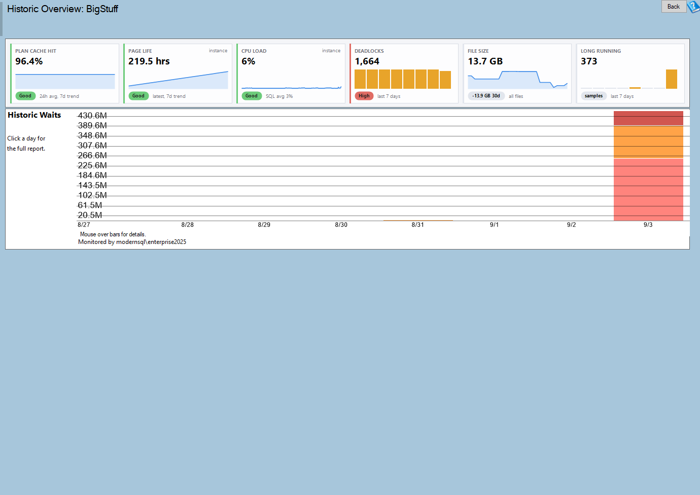
The Historic Overview report is that screen. It opens to a row of metric cards sitting above a stacked chart, and every card is a link into the full report behind that number. You are not choosing between six different pages to check every morning. You glance at one, see which card changed, and click through only for the one that needs explaining.
Historic Overview is one of the reports in Database Health Monitor. It runs against your own servers, and it takes about a minute to have this same screen open on one of them.
| Card | What it tells you |
|---|---|
| Plan cache hit ratio | How often a query found a plan already sitting in memory instead of compiling a new one. |
| Page life expectancy | How long pages stay resident in the buffer pool before something pushes them out, an early signal of memory pressure. |
| CPU | SQL Server’s CPU load measured against idle time across the collection window. |
| Deadlocks | How many deadlocks got recorded, and roughly when. |
| File size | How much the database’s files have grown. |
| Long running queries | The slow-query samples the collector picked up. |
A card that has nothing to show displays an error instead of staying blank, so a broken or missing metric is obvious rather than easy to miss.
The Chart That Earns Its Width
Everything else on the page reduces to one number over time, which a card states more plainly than a chart could. Wait time does not reduce that cleanly. It has categories, and which category is growing matters as much as the total. That is why the stacked waits chart is the only chart on the page: it is the one metric whose shape tells you something a single figure would flatten. Watch it alongside the cards. A wait category climbing at the same moment a card moves is usually the same event, seen from two angles.

Reading It Without Guessing
- Scan for the card that moved, not the card that is simply high. A number that has always been high is normal for this server; a number that just changed is the one worth chasing.
- Put page life expectancy next to CPU. Both dropping at the same time usually points at memory pressure rather than a bad query plan.
- Check the plan cache hit ratio before anything else. A ratio that keeps falling usually means ad hoc SQL is flooding the cache with one-time plans.
- Look at the waits chart underneath whatever card changed. A category rising in step with it confirms what the card is already telling you.
- Click the card instead of hunting for the underlying report by hand. That link is the fastest way there.

Patterns Worth Recognizing Before You Need Them
| What you see | What it usually means |
|---|---|
| Page life expectancy sliding down while file size climbs | The database has outgrown the memory it was given. |
| Plan cache hit ratio dropping as long running queries rise | Queries are not being parameterized, so every call compiles, and that compile time shows up as duration. |
| Deadlocks bunched into one narrow stretch of the window | A single incident rather than an ongoing pattern, worth a look in Deadlocks by Database for the timeline and the objects involved. |
| Cards steady but the waits chart changes shape | Something shifted that no individual card is built to track. The chart notices it first. |
| Every card flat with nothing to show | Historic collection is almost certainly not turned on for this instance. |
Where It Lives and What It Needs
This is a database-level page: pick a database in the tree, and Historic Overview is one of its sections. Everything on it reads from the +’DBHealthHistory’+ repository that the collection process fills in, so if collection has not been set up for that instance, the cards have nothing to draw from and the page comes back empty, not broken, just unfed. Because it reads recorded history instead of the live instance, it still works when the monitored server itself is unreachable, which is exactly when you are most likely to want it.
Once a card tells you what moved, do not stop there, click through. The overview’s job is to point, not to diagnose. A falling plan cache hit ratio leads to Plan Cache and One Time Use Queries. Deadlocks clustering somewhere leads to Deadlocks by Database. A CPU card pointing at a spike leads to CPU by Hour by Day. The whole reason this page exists is to get you to the right follow-up report fast, on the first click, instead of the fifth guess.
Try Database Health Monitor Today
You stop guessing whether last month was actually different and can point at the exact metric, and the exact week, where it changed. Database Health Monitor shows it on every instance you connect, in the time it takes to open the report.
Download Database Health Monitor and run the Historic Overview report against your own server. There is nothing to configure first, and you will know inside a few minutes whether it tells you something you did not already know.