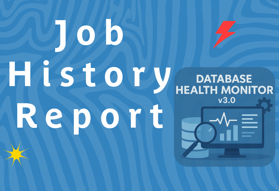
Job History, Problem Indexes and Backup Reports
At Stedman Solutions, we are always working to make SQL Server management easier and more effective. In Database Health Monitor, we have several reports and enhancements that help you better understand what’s happening across your SQL Servers.
One of the highlights is the Job History Chart. Viewing job history in SQL Server Management Studio often felt like sifting through fragmented data without much context. With the redesigned job history report, you now get a clear 24-hour view of all jobs running on your SQL Server, including comparisons to yesterday’s workload. Each job is displayed visually on the timeline with start and stop times. This makes it much easier to see overlaps, long-running processes, or unusual patterns.
There is also a color-coded heat map across the top of the chart that shows CPU usage. This makes it simple to spot when too many jobs are running during periods of high CPU load. Instead of guessing when to schedule jobs, you can now use this visualization to balance the workload more effectively. And if your environment has hundreds or even thousands of jobs, filtering is built in so you can zero in on just the ones you care about.
Another big report is the Problem Indexes Report. While SQL Server Management Studio lets you see indexes, it does not clearly indicate when an index is disabled. That’s a problem, because a disabled index just sits there taking up space without providing any benefit. Worse, it can give you a false sense of security if you assume it is still helping queries. With the new report, disabled indexes stand out immediately so you can decide whether to re-enable them or drop them.
We also included fill factor details in this report. Many times, indexes are created with low fill factors that can cause wasted space and unnecessary overhead. For example, a fill factor of 50 means every page is only half full, which was sometimes useful years ago on spinning disks but rarely makes sense with today’s SSDs. Our recommendation is typically 90 percent or higher, often 99 percent. The report makes it easy to spot fill factors set too low and even provides scripts to adjust them.
Finally, the Backup Reports to give more clarity into how your backups are really performing. The backup size report now clearly shows changes in size over time, distinguishing between full and differential backups. This helps you understand growth trends and plan your backup strategy more effectively. The Backup Timeframe Report, shows when backups are actually running over a two-week period. This is a great way to verify that backups are happening when expected. If you see a gap, like two weeks without a full backup, that’s a clear warning sign to take action immediately.
These features in Database Health Monitor continue our mission to give SQL Server administrators the tools they need to prevent problems before they become disasters. If you haven’t tried Database Health Monitor yet, you can download it for free at DatabaseHealth.com.
If your SQL Server environment needs more than monitoring—such as expert tuning, Disaster Recovery, or ongoing care—our team at Stedman Solutions offers SQL Server Managed Services. With more than three decades of SQL Server experience, we provide proactive management, 24/7 alerting, Mentoring, and immediate response when problems occur.
Need help with this or anything relating to SQL Server? The team at Stedman Solutions can help. Find out how with a free no risk 30 minute consultation with Steve Stedman.