SQL Server Signal Wait Time: The Metric Everyone Skips
A report that used to land by six every morning now finishes after nine, and it has crept ten minutes later every week for a month. The easy answer is the disk. Someone checks Task Manager, sees the CPU sitting at forty percent, and rules out CPU pressure on the spot. Nobody checks the number that would actually settle it: how much of that wait is the resource being slow, and how much is signal wait time, a thread ready to run with nowhere yet to run.
What does signal wait time mean in SQL Server? Signal wait time is how long a SQL Server thread sits ready to run after the resource it was waiting on already became available, queued for a scheduler instead. A high signal share on a wait type means CPU pressure, not a slow resource, even when the total wait time looks identical to a genuine storage or locking problem.
In this post
- The number everyone checks first, and why it lies
- What signal wait time actually measures
- What it needs, and what it doesn’t touch
- Wait types don’t travel alone
- Reading the chart: bars, bands, and chips
- Cumulative totals versus a live read
- What the grid adds, and what nothing here will tell you
- Patterns that repeat often enough to memorize
The number everyone checks first, and why it lies
CPU percent is a fine number for the wrong question. It tells you how busy the processors were, not how long anything waited to get one. A server can sit at forty percent and still have threads queued for a scheduler, because forty percent busy on eight schedulers is not the same as forty percent busy on one, and a query does not care about the average. It cares about its own queue.
Total wait time has the opposite problem. Add every wait type SQL Server has ever recorded and the biggest number usually points at storage, because IO waits accumulate fast on any system that reads a lot of data. That total does not say whether the storage is actually slow, or whether it answered instantly and the thread then sat in line for a CPU that was busy elsewhere. Two completely different problems produce an identical wait time.
What signal wait time actually measures
Every wait sys.dm_os_wait_stats records has two halves. Resource time is genuine: the disk had not returned the page yet, or a lock was held by someone else. Signal time starts the moment that resource lets go and ends when a scheduler actually picks the thread back up. A wait that is three percent signal is a slow resource. A wait that is ninety-six percent signal is a resource that answered promptly, sitting behind a CPU that could not get to it fast enough. Same wait type, same total, opposite root cause.
The header above the chart does some of that arithmetic already: total wait time, the biggest category’s share, and, only when signal accounts for fifteen percent or more of everything on the page, a third line calling it out. Under that mark, category share is the real story. Over it, that line deserves the first read, since a chunk of what reads as resource waiting is actually a scheduler queue in disguise.
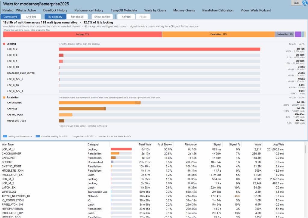
Waits is one of the reports in Database Health Monitor. It runs against your own servers, and it takes about a minute to have this same screen open on one of them.
What it needs, and what it doesn’t touch
Reading this needs one permission, VIEW SERVER STATE, because sys.dm_os_wait_stats is a server-level view. The read itself normally finishes before you would notice it ran, though the timeout is set generously, 45 seconds, in case something else on the box is struggling. Nothing gets installed on the monitored server itself, and nothing gets written back to it either, apart from an ignore list entry if you explicitly add one. That ignore list lives in a separate historic repository and needs to be configured before the feature turns on; skip it and the rest of the page behaves exactly the same, only the ignore menu item goes quiet. This report covers the whole instance. A similarly named page, Waits by Type, asks the same question one database at a time; they are not interchangeable.
Wait types don’t travel alone
Under the hood, sys.dm_os_wait_stats returns a few hundred rows, and most of them are threads SQL Server parks on purpose while it waits for something to do. What is left sorts into eighteen categories, and the sorting matters more than any single row does. PAGEIOLATCH_SH, PAGEIOLATCH_EX, and IO_COMPLETION show up as three unrelated lines in a raw list. Grouped, they are one answer: storage. A flat list cannot say that. A category can.
Each category carries its own color, and every wait type inside it gets a shade of that color, darkest for whichever member is biggest that day, so a family reads as one at a glance. Unclassified gets treated as a legitimate answer instead of a shrug: a wait type this version does not recognize yet is shown, flagged, and left for you to look up, not buried in a catch-all.
- About seventy wait types, plus every wait type starting with
SLEEP_orPARALLEL_REDO_, count as background noise and stay hidden by default LAZYWRITER_SLEEP,CHECKPOINT_QUEUE,XE_TIMER_EVENT, and the variousBROKER_*andHADR_*housekeeping waits fall into that hidden group- A Show benign button brings the hidden rows back instantly; nothing was ever thrown away, it is just a redraw
- There is no percentage cutoff anywhere on this page, unlike some older wait reports that stopped at a fixed threshold and could miss a real problem on a busy modern server
Storage looking slow and storage being slow are two different questions, and only the latency on the specific files answers the second one.
Reading the chart: bars, bands, and chips
Above the individual bars sits one full-width stacked bar, the budget strip: one band per category, widest first, each wide enough band carrying an inline label like IO 43%. Click a band and the whole page filters down to that category, chart and grid together; click it again and the filter lifts. Every bar on the page, budget strip included, shares a single scale. Nothing gets normalized row by row, on purpose, because a normalized bar cannot be compared honestly to the one sitting next to it.
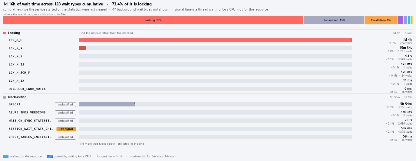
Underneath each category heading, every wait type gets a name in monospace, an optional chip, a split bar, and a total. A row earns a red chip once its own signal share reaches fifty percent, amber starting at twenty-five. Unclassified and background chips stay outlined instead of colored, because they are context, not a verdict. Whichever rule matches first wins, and a genuinely healthy row gets no chip at all.
| Chip | Appears when |
|---|---|
62% signal (red) | Signal share is 50 percent or more of that wait type’s own total |
31% signal (amber) | Signal share is 25 percent or more |
unclassified | The wait type is not in the taxonomy yet |
background | Visible only because Show benign is switched on |
Cumulative totals versus a live read
Cumulative mode shows exactly what sys.dm_os_wait_stats already holds in memory: a running count since the last service start, or since somebody last reset the numbers, folding in things like a reindex job from two weeks back. It costs nothing to read and it describes the overall shape of a workload well. A live mode instead treats whatever is on screen as a starting point and shows only what changed between one sample and the next, sixty seconds apart by default, with that first sample pulled forward to ten seconds so the page is not sitting empty while you wait. If a counter ever drops instead of climbing, something reset it mid-session, and the baseline quietly re-arms.
Switch to Flat top 25 and the category headings disappear; you get the twenty five largest wait types on their own, each keeping a small color tick so you can still tell which family it belongs to. That is not a bug: each percentage compares against every wait type currently on screen, not merely whatever the current view happens to draw.
What the grid adds, and what nothing here will tell you
The grid holds every row the chart could not fit, plus a few columns bars cannot express: number of waits, average wait in milliseconds, and each row’s percent of everything currently visible. Signal percent is the only column that gets color, using the same fifty and twenty-five percent breakpoints as the chips. There is no status column anywhere and no verdict of any kind. The biggest category is simply the widest band you can see. Nothing on this page decides for you that a category is a problem; it only shows where the time actually went.

Double-click any bar or grid row and a dialog opens with a severity line, a plain description, which SQL Server versions the wait type applies to, and a short list of suggestions. Where nothing specific exists yet for a given wait type, it falls back to guidance for the whole family and says so plainly. Right-click instead and you get a script covering the same counters, plus a second query naming whoever is waiting on that wait type right now, handy for handing off to whoever owns the box. None of it changes anything on the server, and there is still no button anywhere on this page that clears a counter; the command that could is only ever named, never run for you.
Patterns that repeat often enough to memorize
- IO dominant with a low signal share points at genuinely slow storage, or a query pulling far more data than it needs; check the specific file’s latency before blaming the drive
- A high signal share showing up across several categories at once usually means CPU pressure: the resources are answering fine, threads just cannot get a scheduler fast enough
- Locking sitting at the top means go find whoever is doing the blocking, not the sessions stuck waiting behind them
CX*parallelism waits leading the chart are often normal on a server built to run parallel plans, though it is worth checking cost threshold and max degree of parallelism togetherASYNC_NETWORK_IOnear the top is almost always an application reading results one row at a time, rarely the network itself- A large Unclassified bar is a newer wait type this version does not recognize yet, worth a quick lookup rather than a shrug
- Everything reading small with nothing standing out is a genuinely healthy answer; if the box still feels slow, look at CPU or the client instead
None of this needs anything more invasive than a single DMV read that finishes before you would notice it ran. What it needs is looking at the split before the total, because the total on its own has misled more people than it has helped. A wait type spending most of its time actually waiting is a resource problem. One spending most of its time queued and ready is a scheduler problem wearing the same name.
What to check on your own server
- Check how long the instance has been up since the last restart or wait-stats clear before trusting a cumulative number
- Query sys.dm_os_wait_stats where waiting_tasks_count is greater than zero and calculate what share of the total is signal wait
- Flag any wait type where signal time is 25 percent or more of its own total instead of judging by total wait time alone
- Watch several live intervals rather than one cumulative snapshot before deciding a category is the real story
- Look up by name any wait type that does not match anything you recognize instead of ignoring it
Try Database Health Monitor Today
It turns a wall of raw DMV numbers into one picture of what this instance is actually waiting on, and whether that wait is CPU pressure wearing a different name. Database Health Monitor shows it on every instance you connect, in the time it takes to open the report.
Download Database Health Monitor and run the Waits report against your own server. There is nothing to configure first, and you will know inside a few minutes whether it tells you something you did not already know.